The Home Owner’s Loan Corporation and their mortgage lending maps are an often cited malign influence on residential segregation in American cities. The maps assigned grades to different neighborhoods to rank the safety of a given mortgage within the neighborhood. These ranks, A - D, were heavily influenced by the racial make up and density of the neighborhood being surveyed. In Louisville (and pretty much every other city in the US), minority neighborhoods were assigned D and C ranks, which has been connected to decades of disinvestment.
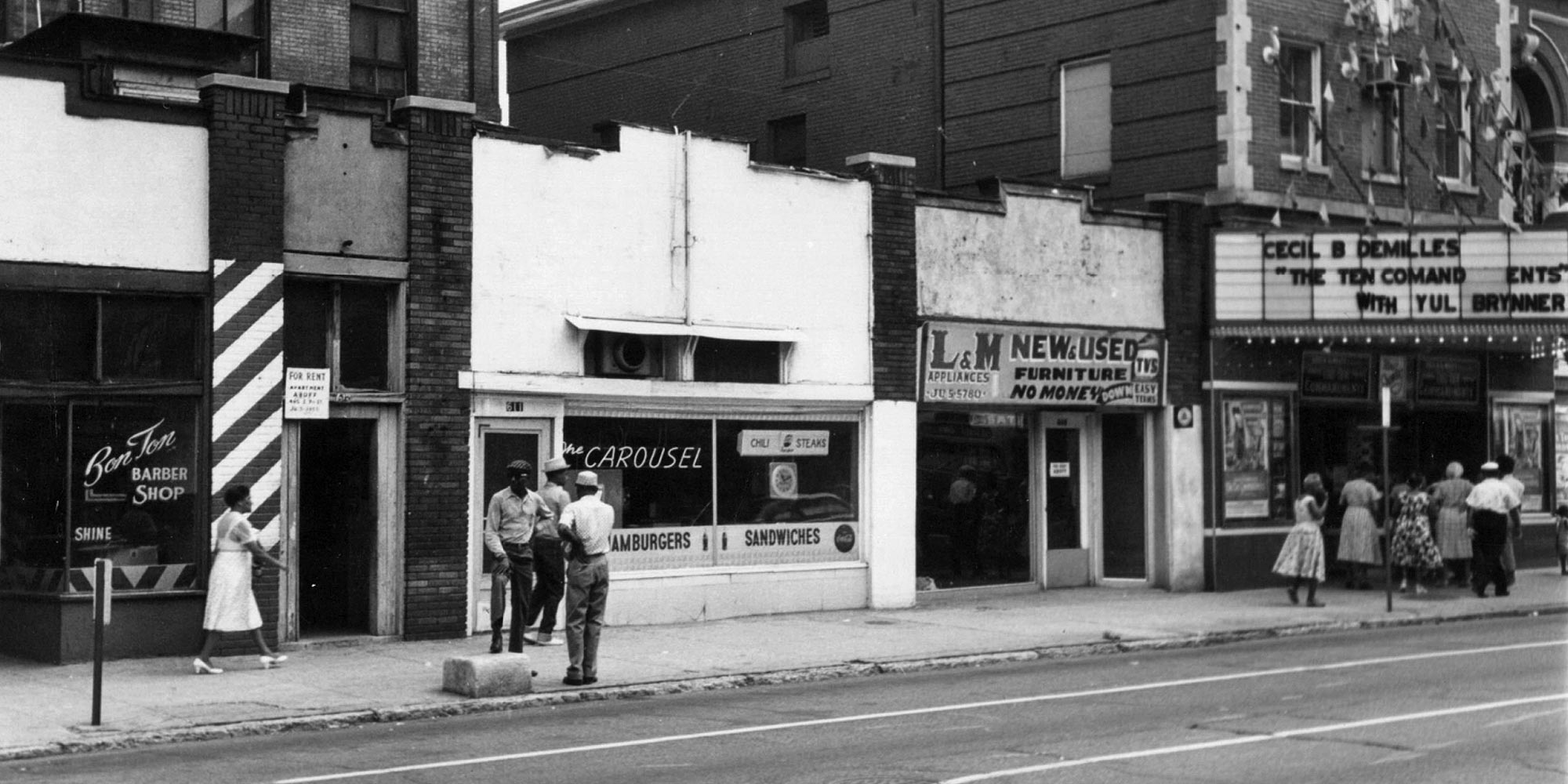
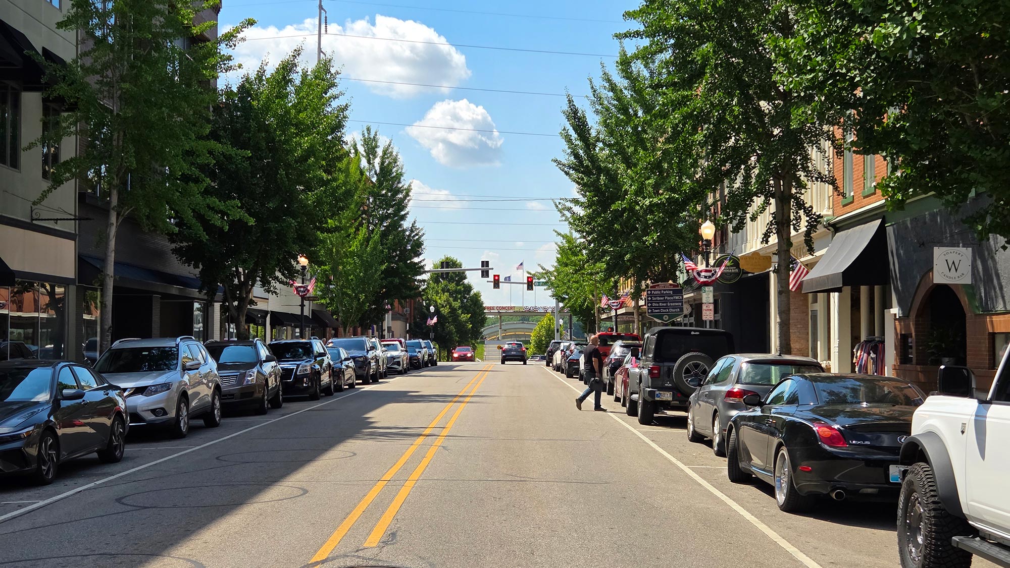
This disinvestment has been reflected in many ways. Some serious health conditions are more common in redlined neighborhoods. Crime, such as gun violence, is more common in redlined neighborhoods. Redlined neighborhoods have lower tree canopy coverage. Another important realm is how residential segregation has affected the built environment, especially streetscapes. Car-centric, underdesigned streetscapes can lead to higher numbers of crashes involving pedestrians and bicyclists. There is some evidence already that redlining has a significant effect on pedestrian safety in other cities, but does this hold true if we look at Louisville?
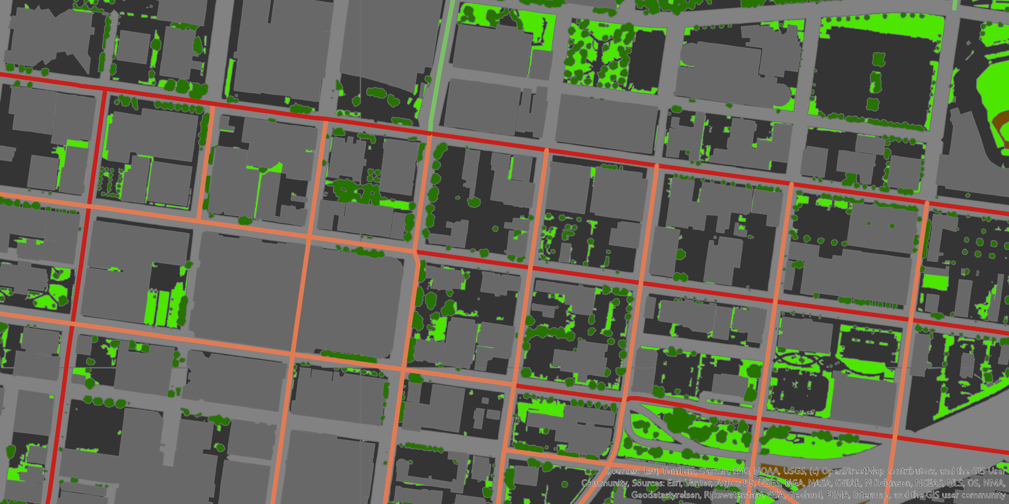
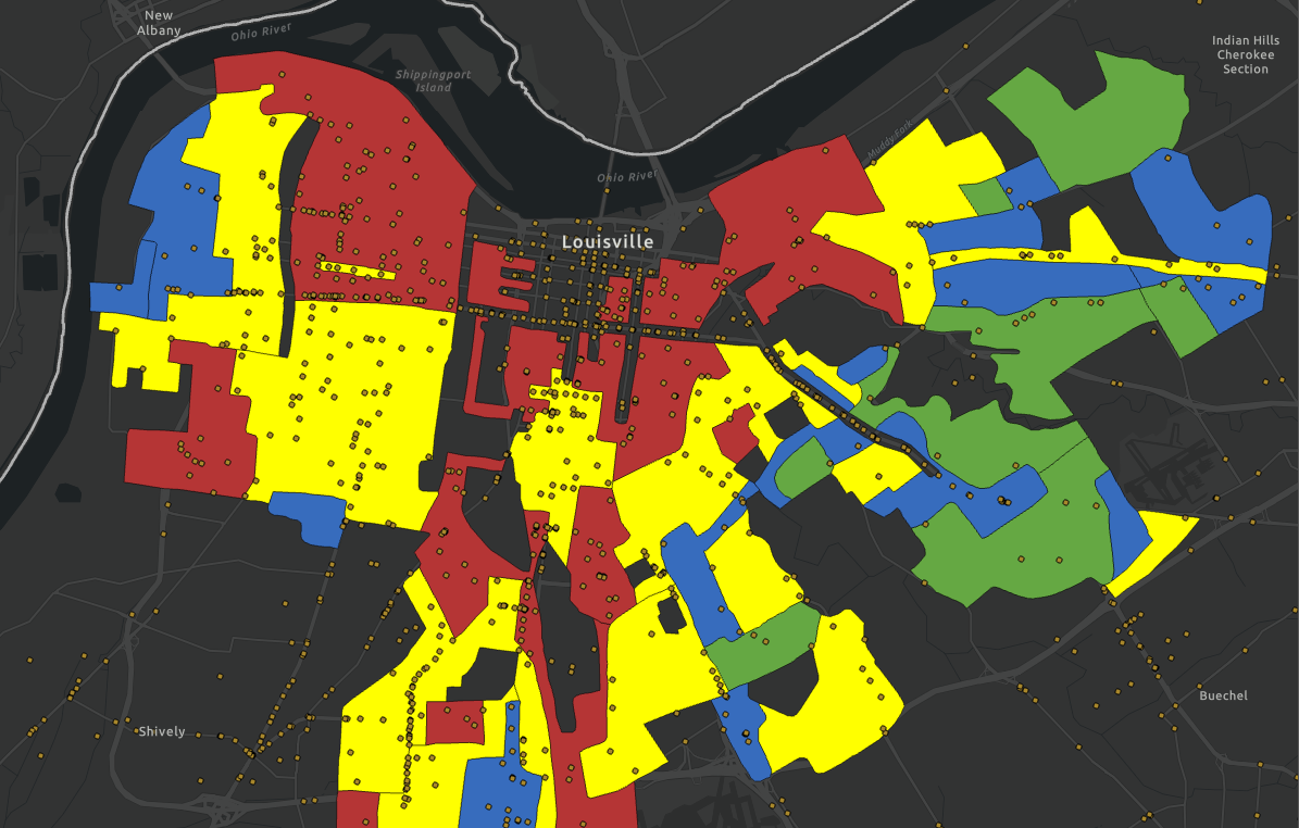
For this exercise, I took crash data in Louisville for the past 5 years and refined it down to just crashes involving pedestrians and bicyclists. This gives us a dataset of 2155 collisions. If you map them out and look at the overlap with the original HOLC map borders, you get the result below.
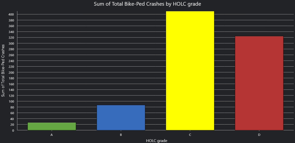
Of the 2155 crashes, 850 took place in the areas graded by the HOLC. This map was made well before the city-county merger, so the footprint is somewhat small relative to the whole county. From raw totals, we see a drastic overrepresentation of bike and pedestrian crashes in the C and D grade areas. Only 114 of the 850 crashes occurred in A and B grade areas, or 13.4%.
Raw crash data may not necessarily tell you much, as there are a few factors that will inherently alter the results. C and D grade areas, as a whole, take up much more land than A and B grades. This also leads to a population imbalance. The table below breaks down the difference between population, land area, and crashes as percentages.

Of the areas surveyed and graded by the HOLC, 27.4% was assigned a D-grade. Based off the 2020 census, this area has 25.7% of the population of the graded areas. Despite this, D-grade areas represent almost 40% of bike-pedestrian crashes that occurred within the HOLC areas. The overrepresentation of D-grade areas parallels the underrepresentation of the A and B-grade areas, which have a much lower crash rate relative to their populations and land area. The C-grade is the only one that is pretty close to what you would expect, with a very slight underrepresentation in terms of population and overrepresentation in terms of land area.
If you look at the distribution of injuries and deaths stemming from these crashes, the picture changes a bit. C-grade areas become more overrepresented relative to the A and B-grades. D-grade becomes slightly less common for deaths, but remains pretty similar for injuries. Regardless, D-grade is still overrepresented relative to the higher grades.

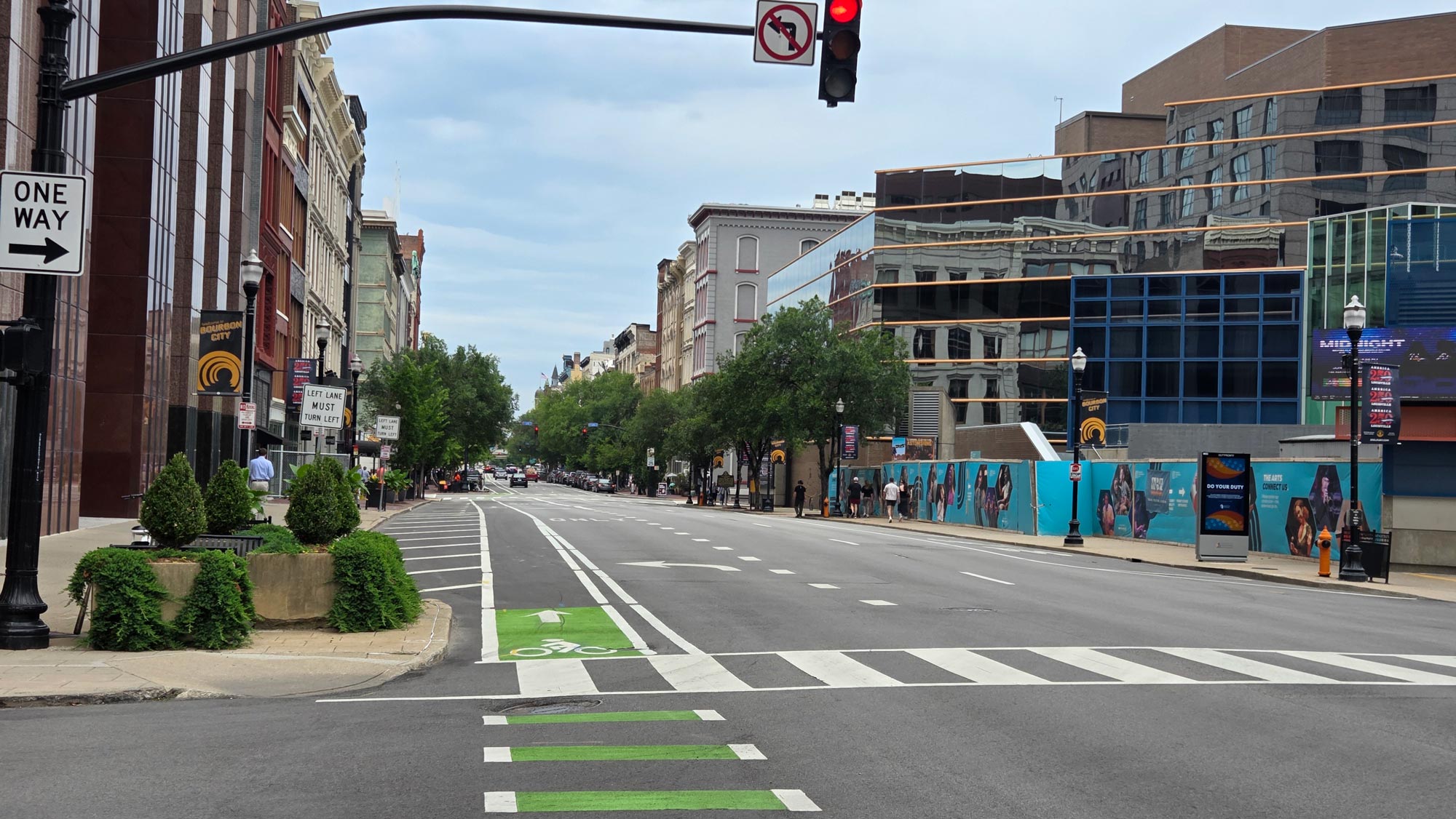
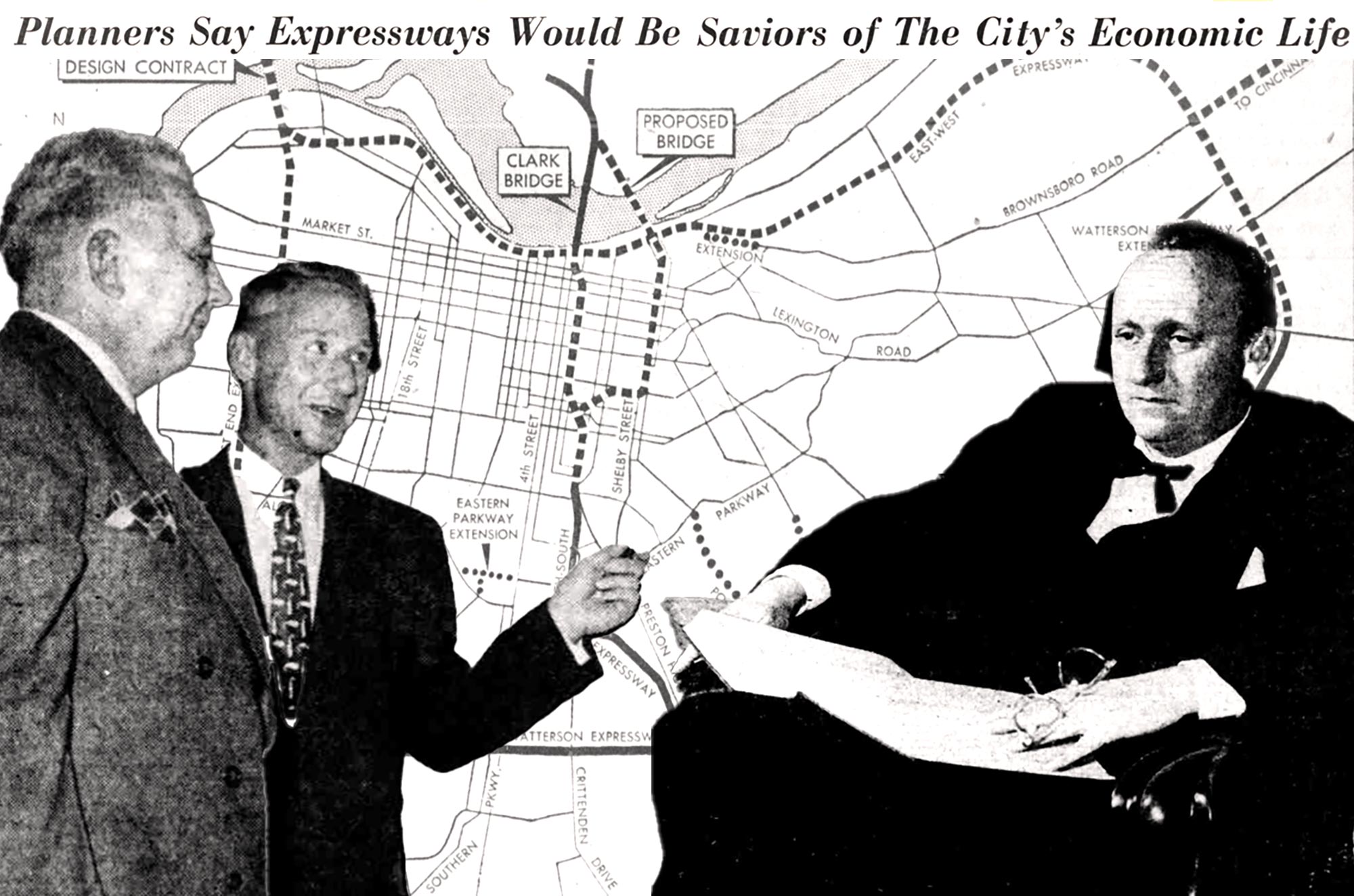
These are not perfect measures, of course, but they give you a general idea of the spatial disparities that exist in bike and pedestrian safety between historically disinvested areas and more historically well-off areas. This difference is also a result of where infrastructure is placed, to some extent. In Louisville and many other American cities, state highways and expressways were purposely rammed through redlined minority communities. Decades of disinvestment (not just originating from HOLC policy) made this land the cheapest to buy for state and federal officials, while also allowing policymakers to form a physical spatial barrier between white and black communities. In Louisville’s case, neighborhoods such as Smoketown, Portland, Parkland, and Shawnee bear the brunt of this kind of infrastructure.
This is also why, in this context at least, it may not make sense to account for traffic counts and similar data points when looking at the spatial distribution of bike and pedestrian crashes. These communities were purposely chosen to host high-traffic infrastructure that is dangerous in an urban environment, so accounting for the traffic would neglect that aspect unless done very carefully.
If you would like to take a look at the data yourself, the map below shows the HOLC graded areas. If you click on them, it tells you the total number of crashes, injuries, and deaths within them.
Click here to open the map in a separate window.