The Urban Health Index and its methodology was created by the World Health Organization and Georgia State University’s School of Public Health. The index measure is meant to function as a singular metric that can highlight differences in health-related attributes within specific areas. It can utilize a plethora of health determinants, ranging from common physical conditions to sociodemographic factors. The index has been used in a variety of cities worldwide, such as Shanghai, Tokyo, and Atlanta. The app below follows the model of health determinants that Atlanta, Georgia used in 2014, which are largely economic and sociodemographic. Full details on the Urban Health Index can be found here.
The model used in Atlanta used indicators related to educational attainment, poverty status, employment, and income so that is what is used in the index for Louisville as well. The data is taken on the census block level and standardized. Lastly, it is amalgamated into a single standard value, weighing each indicator the same in our case. The math of it all can be seen in the handbook linked in the first paragraph.
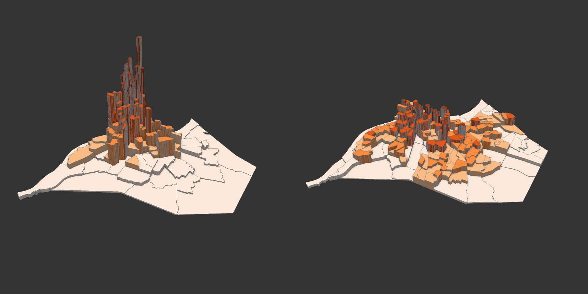
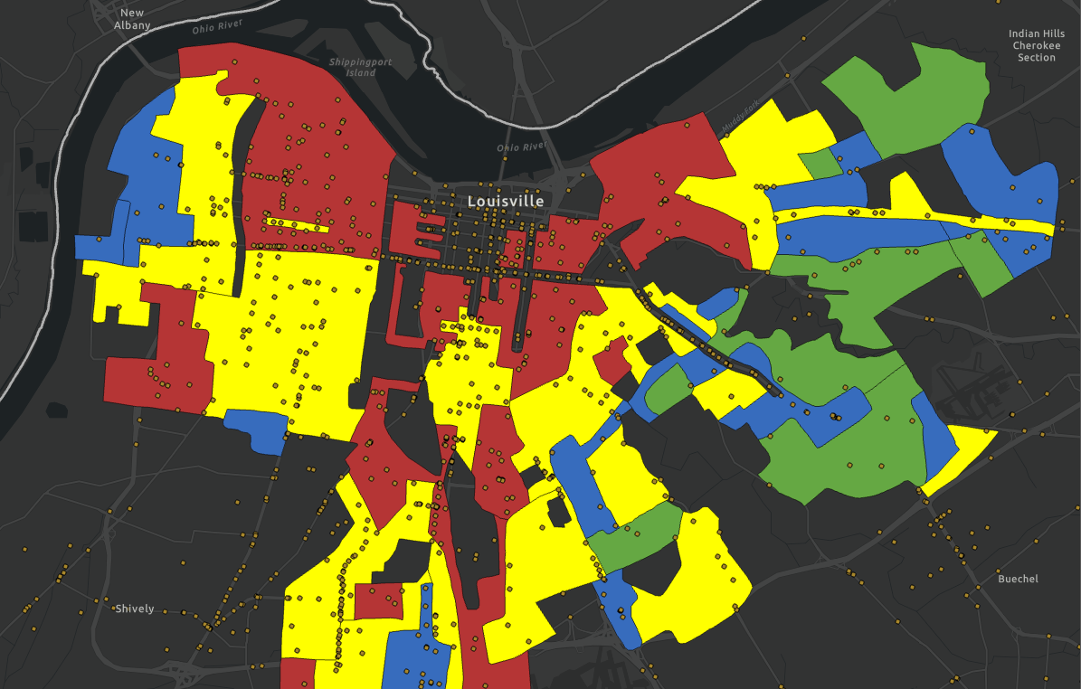
Louisville’s results paint a picture of disparity between the west end and east end of the cities, one that is often illustrated in indexes/projects like this. Almost every single tract in the bottom 50% of the index rankings are in the western end of the city. There is more of an extreme difference for some specific tracts seen when looking at the distribution of rankings.

You can see a bit of a “break” between most points on the chart at both ends, representing the tracts with the biggest difference in urban health based off the selected indicators. Around 20% of the city’s tracts lie within the “extreme” ends. Tracts on the high end average a score of 8.3 compared to 1.6 on the bottom end, with a city average of 4.97. The disparity ratio between tracts is 5.1, which indicates a relatively high amount of disparity within the city.
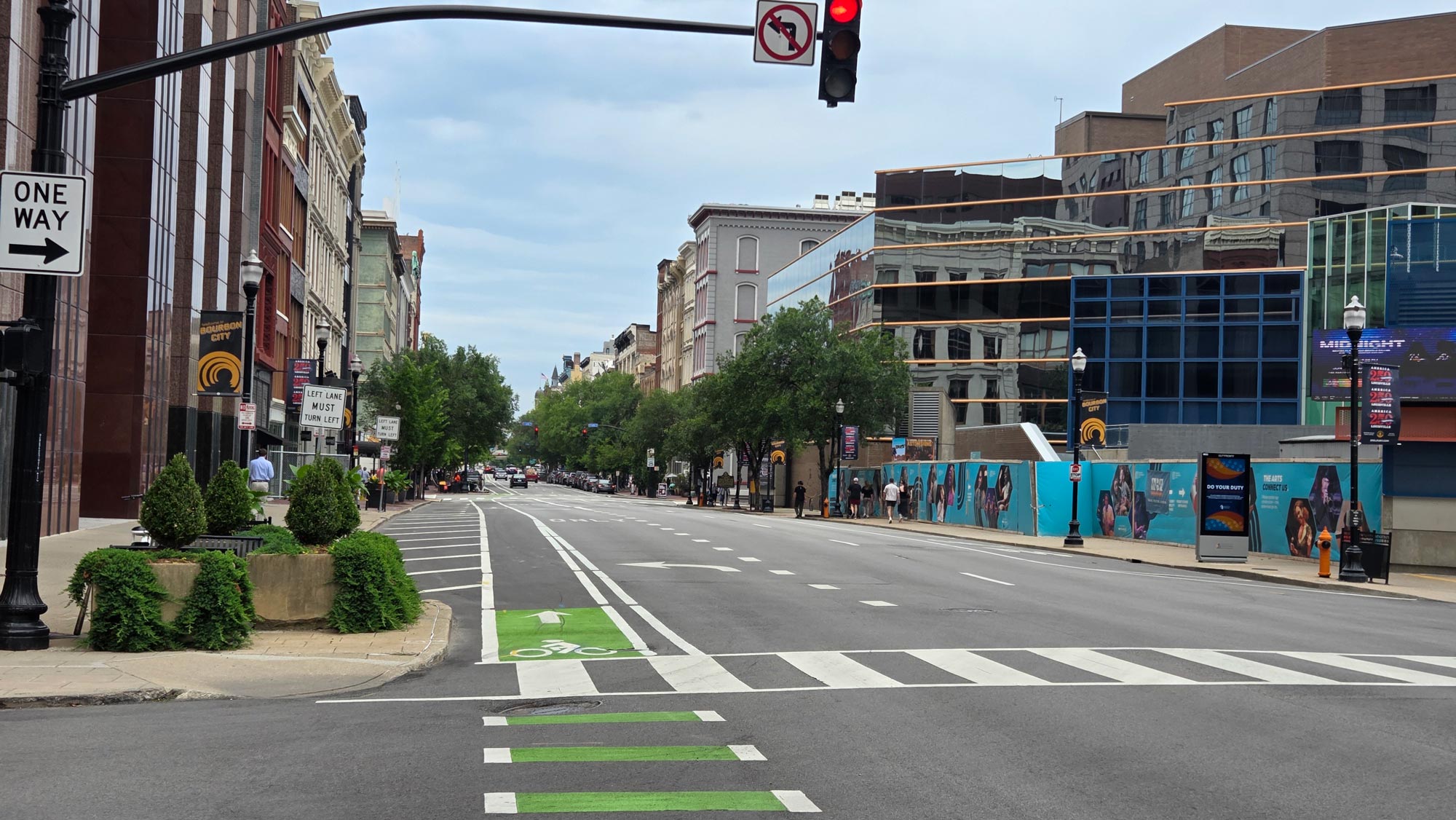
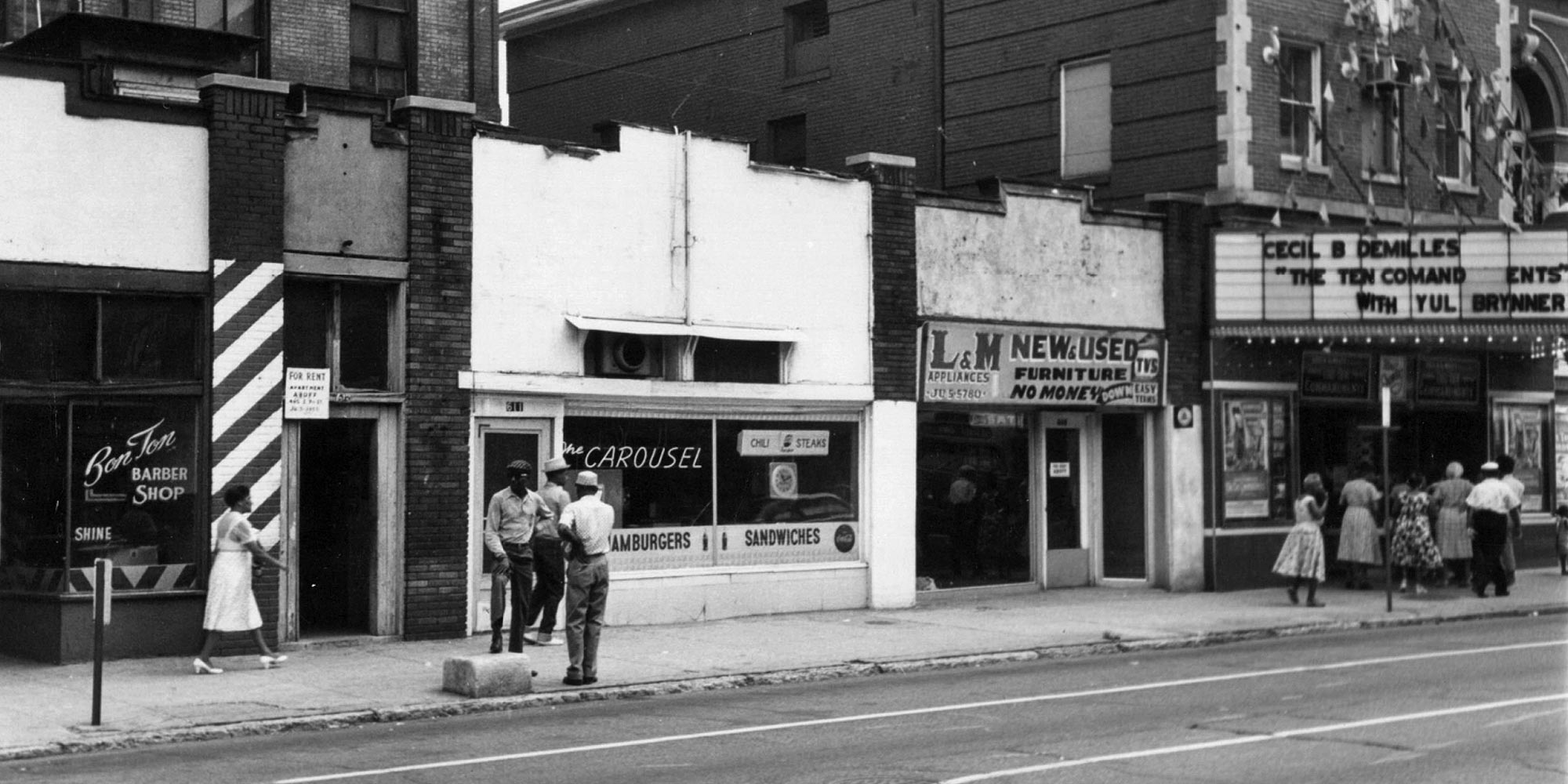
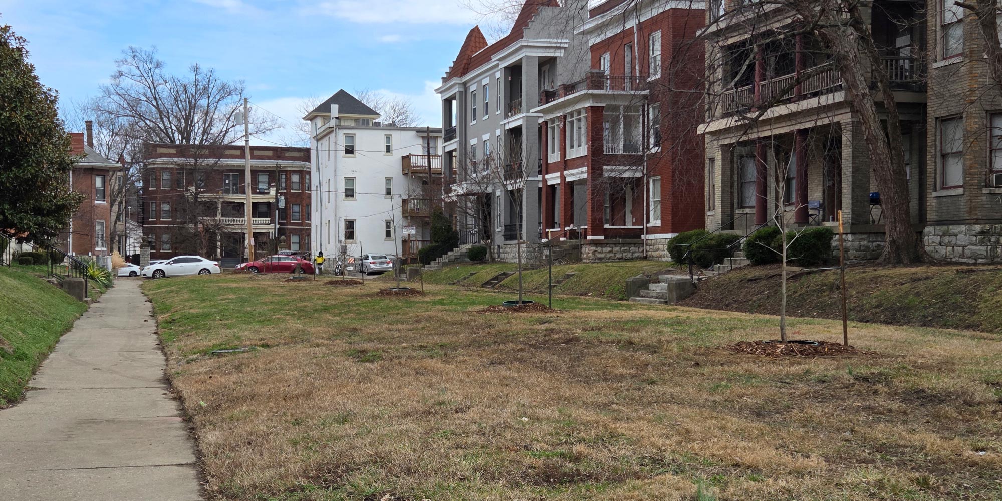
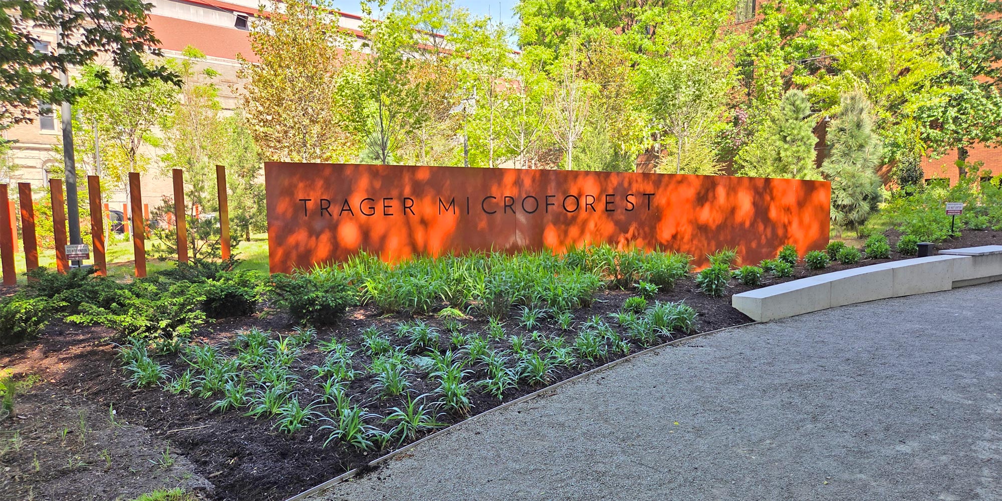
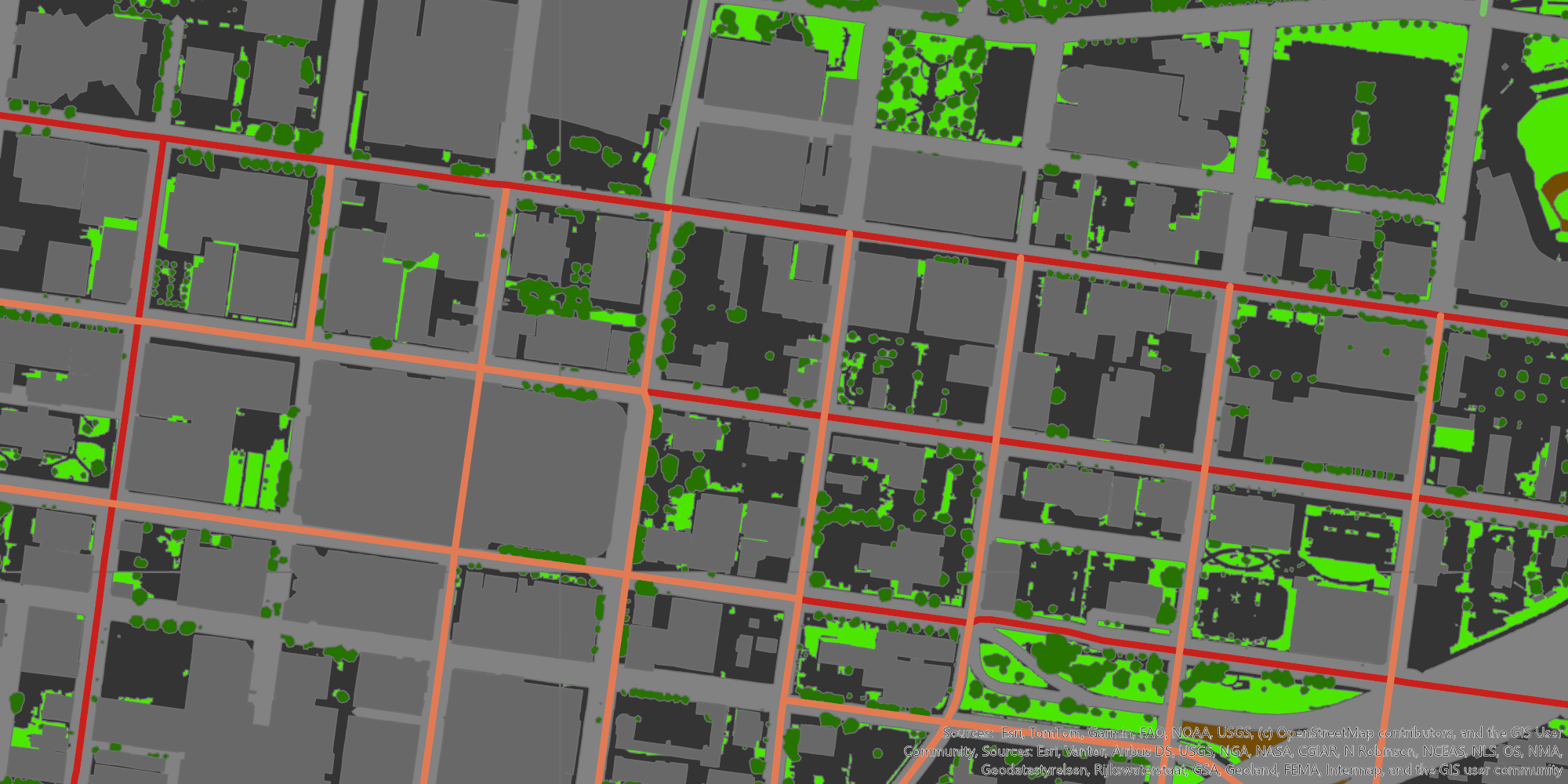
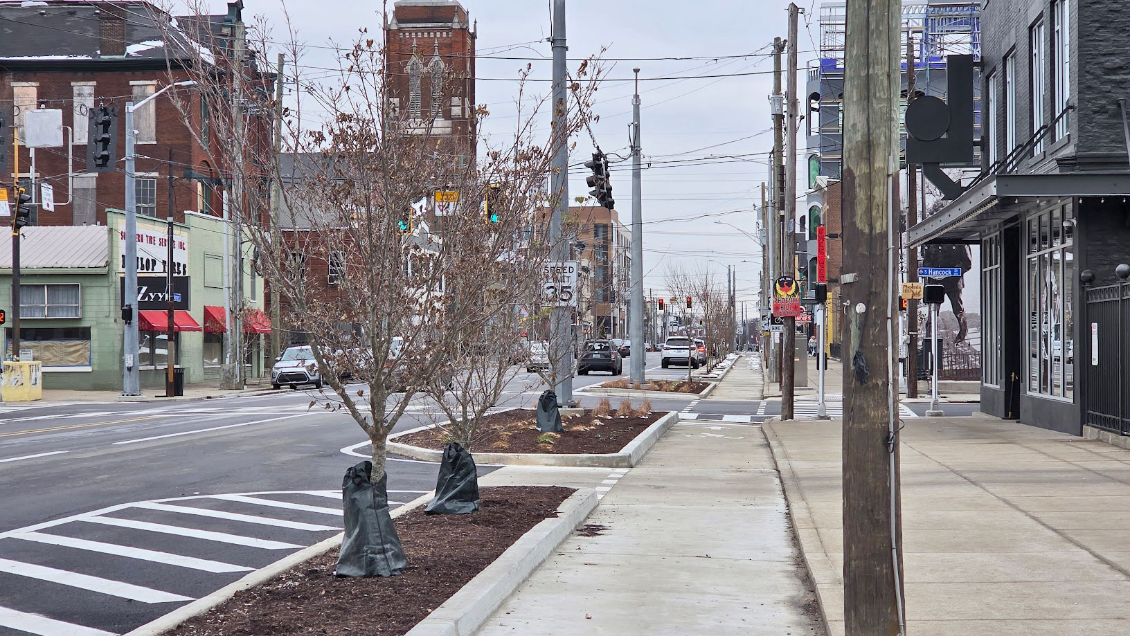
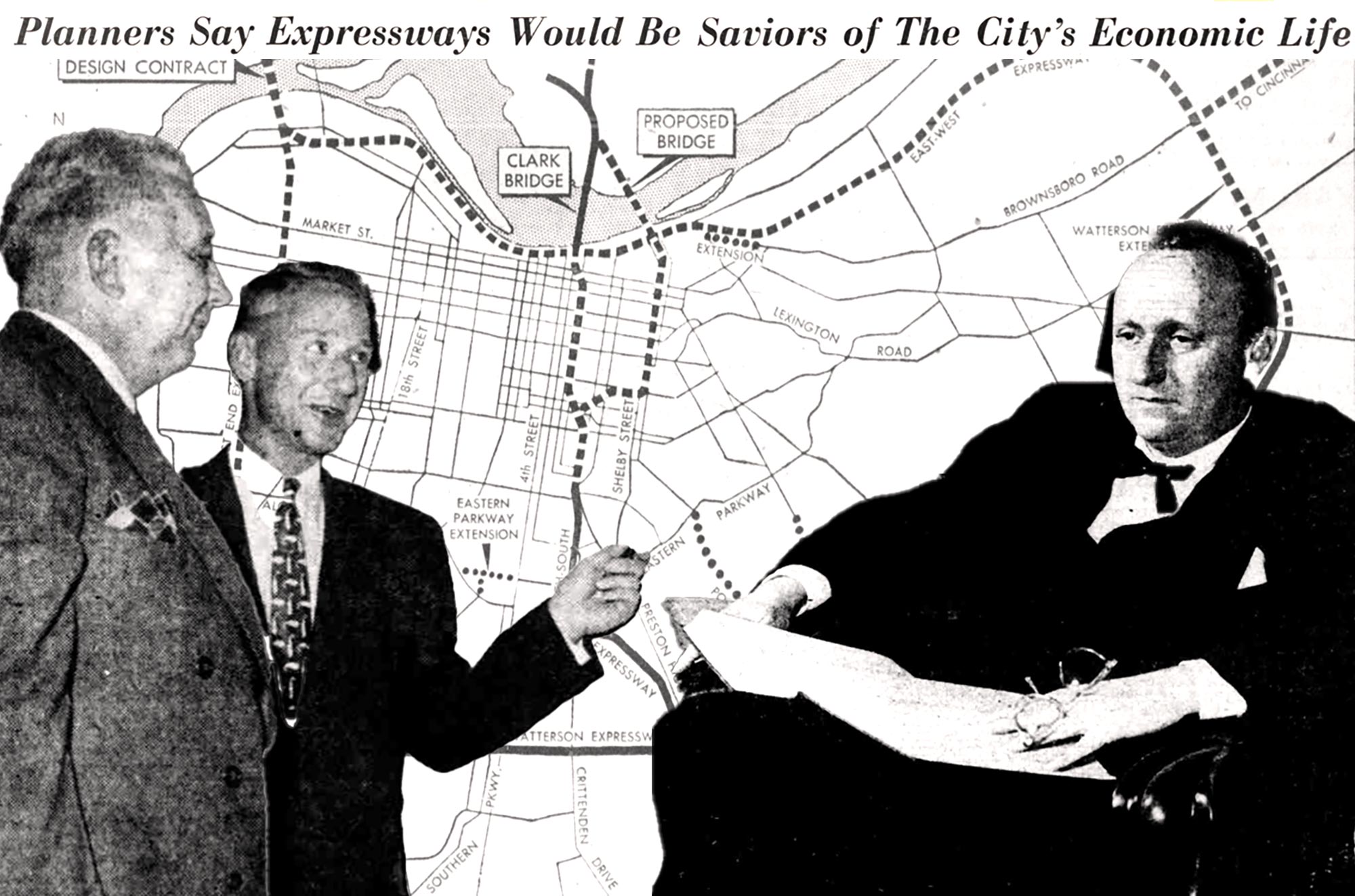
The highest ranking tract (which means lowest index score/health rating) is also the location of the 9th Street Divide, a historical barrier between the city’s white and black populations. The tracts on the other end of the spectrum are generally far-east, rich suburban areas such as Norton Commons and Prospect. The tracts that rank highly also tend to be Justice40 tracts, facing systematic disadvantages and burdens caused by histories of disinvestment and redlining. Many of these areas also lack important aspects of the built and natural environment such as tree canopy and grocery access, among other things.
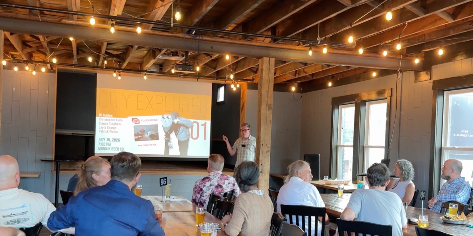
See the full app below or click here to open in another tab.